Horror Film Poster Analysis
The Shining:
This poster for
this film features a lot of red colours for the title and background which fits
the theme of horror. This suggests that there is going to be violence and
possibly killing in this film, which is also suggested by the knife. The red
contrasts with the greys of the main image and is also the brightest colour on
the poster, to make the title stand out and catch the audience’s attention.
The fact that
this poster is quite colourful means that it differs from other horror film
posters that are stereotypically very dark in colour with very limited amount
of colour.
The main image is a girl
with a knife held across her face with the reflection of a man in it, looking
angered whilst she is looking scared. This already suggests a good and an evil
in the film (Binary Opposition) without the audience watching it. This can
intrigue the audience as they already know that the man is dangerous, but they
don’t know to what extent.
Around the main image on
the right side is also is darker than that of the left side. This could suggest
that there is a shadow following her which is also suggested that it is the man
for the knife reflection. The fuzzy look from the knife could also suggest the
main character’s confusion at the situation. The shadow may imply that it is
nighttime which is when most stereotypical horror films occur as things appear
scarier in the dark.
The poster also has two
actors’ names at the top to tell the audience who is going to play a main role
in the film. This can attract audiences as these may be famous actors who will
appeal to more people as they may have liked their previous films. This is also
achieved by the billing block at the bottom which features others that were
included in the making of this film.
The Conjuring:
In this film poster, it lacks a lot of colour. This could be to show that
the lifelessness that this film displays in it. the background shows a very
grainy and distorted which could suggest the environment that the film is set
in is parallel to this.
The very dark colour scheme could also suggest the dominant environment
throughout the film is in the dark or at night which most horror films are as
they create a scarier atmosphere that light colours would. Some of the dark
colours are achieved using shadows which is a common convention of horror film
posters.
The main image shows a rocking chair which is stereotypically in horror
films that tends to move unexpectedly without the main characters knowing
what’s doing it. this can suggest that there is some sort of paranormal
activity displayed in this film. According to genre theory, all films within a
genre have similar conventions but put their own spin on it to make it unique.
This could have been the case for this film also.
The title of the poster stands out in comparison to the rest of the poster,
which is to attract the audience to the name of the film. This can then be used
for them to tell their friends and family (social interaction – uses and
gratifications theory). Therefore, this helps the company to be able to make
most amount of profit from getting more people to watch it.
The font used on the title also infers a quite sinister atmosphere and not
modern.
The bottom of the poster also states that the film is coming out soon. This
gives the audience an incentive to look out for it going into the cinema and
gives a more informative poster as they might think that it is already out.
It also features a point of saying that it has the same director as
Insidious. This is also another popular horror film which would encourage more
people to watch it as they would recognise it and may have liked it.
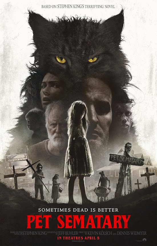
Pet Sematary:
The colour scheme is very similar to most other
posters in the horror genre. This is because it reflects the darker themes that
is present in this genre and comes across more sinister.
The poster’s main image covers majority of the
poster but is comprised of many different pictures that are all overlapped and
made to have a low opacity on them. This could foreshadow that some of the
characters may die as they look ghost-like and the cemetery is below them with
wooden crosses.
Again, like may other film titles in the horror
genre, it is in red. This represents that there will be death present which is
confirmed due to the phrase written above it.
It also includes a date of release to inform its
audience, so they can go to watch it and share with people they know. This
means that the producers benefit from the profits and they can invest this into
another film in the future. This is also in red as it stands out and is
positioned at the bottom of the poster which is likely to be the last place
that the audience look at, so they are more likely to remember it.
The positioning of the camera establishes a good
and evil (binary opposition). This is due to the main characters being at the
top and everything under the ground in the cemetery is evil.
The fact that there are a few people in the
cemetery doing tasks like nothing bad has happened suggests that this is
normal, which could intrigue audiences to wonder what the plot entails.


Comments
Post a Comment